The Death Cross And Market Bottoms
Authored by Lance Roberts via RealInvestmentAdvice.com,
In financial markets, few technical patterns generate as much attention and anxiety as the death cross. This ominous-sounding term refers to a crossover on a price chart when a short-term moving average, most commonly the 50-day moving average (50-DMA), drops below a long-term moving average, usually the 200-day moving average (200-DMA). The “death cross” is a fantastic headline for the media to generate clicks and views. However, for investors, the “death cross” signals a market correction and suggests a more cautious investing approach. But there are a few questions we must answer.
-
What does the death cross mean?
-
How reliable is it as an indicator?
-
And how should investors respond when they see it?
Let’s answer those questions by exploring the death cross’s history, data, and interpretations, and explaining why context matters more than the signal itself.

What Is the Death Cross?
According to Investopedia:
“The “death cross” market chart pattern refers to the drop of a short-term moving average—meaning the average of recent closing prices for a stock, stock index, commodity, or cryptocurrency over a set period of time—below a longer-term moving average. The most closely watched stock-market moving averages are the 50-day and the 200-day.”
For investors, it is essential to note that the death cross is a lagging indicator. It only tells you that price action has deteriorated during the previous two months. In other words, it often only confirms an already obvious trend because it relies on historical data from moving averages. Furthermore, when the death cross occurs, markets are often near a short-term low.
I would be remiss to state that there are periods where the death cross preceded more severe bear markets of the past century, including 1929, 1938, 1974, and 2008. However, that is an example of sample selection bias, expressed by using only the selected data points to prove the predictive power of the death cross. Unfortunately, selecting only those data points ignores the numerous occasions when the death cross signaled nothing worse than a market correction and provided significant buying opportunities for investors.
For example, the following table from Marketwatch shows that since 1950, markets tend to rise within the next 12 months following a death cross.
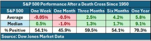
This is because, as noted, the markets tend to be very oversold by the time the death cross triggers, and previous optimistic sentiment has reversed. We noted this in this past weekend’s #BullBearReport.
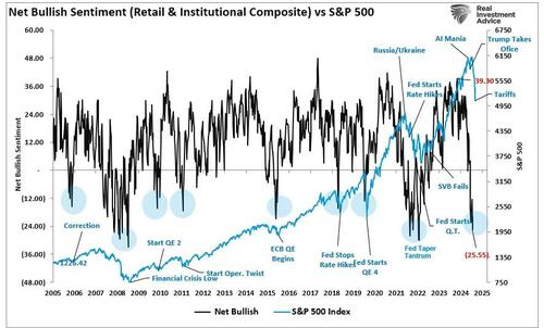
“For example, net bullish sentiment among retail and institutional investors is at some of the lowest levels on record, including during the “Financial Crisis.” The extreme negativity is interesting because the recent decline was orderly and mild compared to the chaos during the financial crisis. Yet, investors are as bearish on the current market as they were then. However, it is worth noting that during previous instances when sentiment was as negative as it is currently, such readings were near market bottoms.”
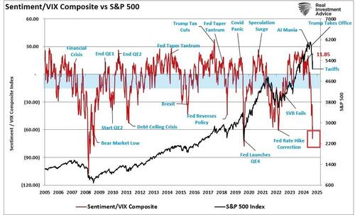
“Furthermore, the sharp spike in the volatility index, which is considered a “market fear gauge,” spiked to the highest levels seen since the COVID pandemic. If we combine the sentiment measures with the volatility index, we again see more extreme negative readings that often coincide with market lows rather than the beginning of larger reversions.”
In other words, historically speaking, the death cross, more often than not, is a potential contrarian indicator. However, as noted above, there have been instances where the death cross led to much more severe declines. How can investors differentiate between the two?
Structural Bear Markets Versus Event-Driven Corrections
While the media often dramatizes the appearance of a death cross, seasoned investors know it is just one piece of the puzzle. Corrections are part of a normal and healthy market process. As discussed in “Bullish Years Have Corrections Too:”
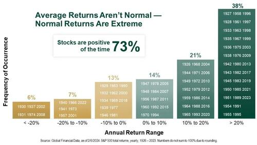
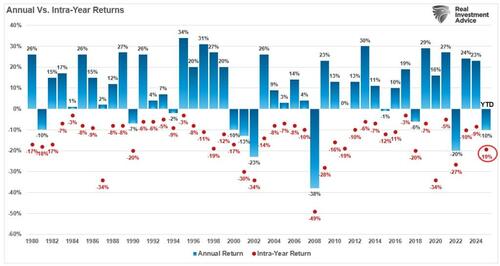
“In bullish years, markets often have corrections. Yet, after a lengthy bullish run, it always surprises me how quickly investors and the media panic with the slightest hint of a market pullback. During bullish years, corrections happen more often than you think. However, when corrections occur, it is not uncommon to see concerns about a “bear market” rise. However, historically speaking, the stock market increases about 73% of the time. The other 27% of the time, market corrections reverse the excesses of the previous advance. The table below shows the dispersion of returns over time. Critically, note that drawdowns of greater than 10% only occur 13% of the time.”
The correction from this year’s market peak is currently in a range that has only occurred 7% of the time historically, with the market declining 19.4% from peak to trough.
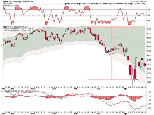
So far this year, the market decline certainly ranks among some of the worst-performing years in history. However, we are only one-third of the way into 2025, so how this year ends is still widely unpredictable.
But it is worth noting that since 1980, only eight (8) years have ended with more significant declines. Could this be the ninth? Yes, but for that to occur, we must put previous market declines and larger bear markets into context.
The difference between whether the death cross is a shorter-term corrective process or a larger “bear market” decline depends mainly on whether the cause of the market decline is “event-driven” or “structural.” As noted recently by the Daily Shot:
“Structural bear markets have historically been the deepest and longest, averaging over 55% declines and lasting nearly four years. In contrast, event-driven bears tend to be shorter and shallower, with quicker recoveries—averaging around 30% declines and under 10 months in duration. Post-WWII averages (orange diamonds) suggest more moderate outcomes relative to the broader historical record.”
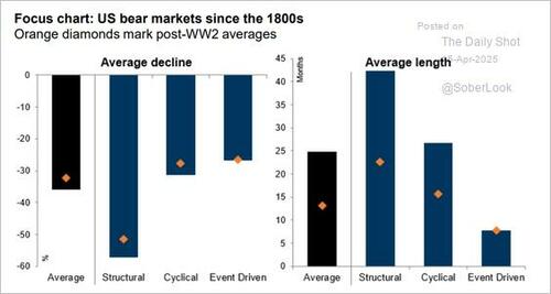
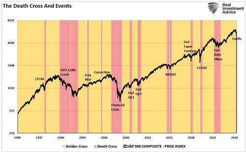
This context is important when examining the current decline and triggering of the “death cross.” The chart below shows the difference in the length of “event-driven” versus “structural” corrections, signified by the triggering of the “death cross.” The dot.com and financial crisis periods were structural events, as significant corporate failures and credit-market dislocations occurred amid deep economic contractions. However, outside of those two significant structural impacts, all other “events” were short-lived, and markets soon recovered.
Given that the current market correction is driven by concerns over “tariffs,” it will likely be short-lived. There are two reasons for this view. First, the announced tariffs, which were more onerous than expected, will likely be largely reduced or removed through negotiations. Second, once the tariffs are finalized, the markets will adjust expectations for earnings and focus on future growth.
The question for investors is how to navigate the current market turmoil until this event-driven correction completes.
Navigating The Uncertainty
Does this mean you should ignore the “death cross” entirely? No. While the current correction is “event-driven” and will likely resolve itself soon, there is always a risk that something could trigger a “structural” decline, such as a recession or credit-related event. While such a risk remains quite low currently, that risk is not zero.
Furthermore, the death cross should not be viewed in isolation or trigger panic-driven decisions. Instead, investors should use it as a cue to take a more thoughtful approach to their portfolio management.
Stay the Course if Fundamentals Are Sound. If your portfolio is well-diversified and aligned with long-term goals, the death cross may just be noise within a broader market cycle.
Use It as a Risk Management Cue. As we noted in “Market Crash: Hope In The Fear,” we used the recent rally in the market to reduce risk, hedge portfolios, raise cash, and rebalance allocations.
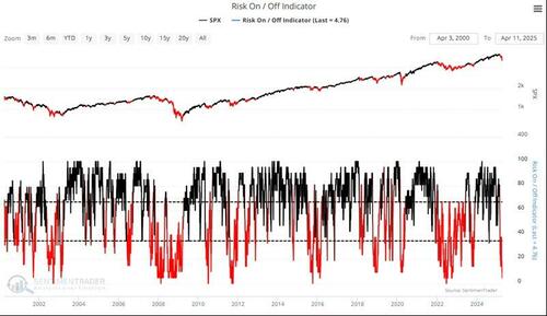
Combine with Other Indicators. As noted above, while ominous, the current death cross collides with deeply oversold technical readings, as shown below, which typically suggest markets are near short-term lows rather than starting more significant declines.
“Sentimentrader tracks 21 indicators in total, which are then combined into a single indicator, giving readings of when markets are trading at more extreme bullish or bearish levels. As shown, the market is currently trading at more extreme risk-off levels. While this does not mean the market is about to rise, historically, such extreme readings have been close to market bottoms.”
Consider Rebalancing or Rotating. Whether the current period is “event-driven” or “structural,” the market will have intermittent rallies which investors should use to rebalance risk, reallocate holdings, and increase cash levels to reduce volatility.
Don’t Ignore the Golden Cross. While it is easy to become overly defensive during a corrective period, it is important to remember that eventually the “death cross” will reverse the crossover. When the 50-DMA rises above the 200-DMA, it creates the golden cross, which follows the market bottom. That signals a reversal of the previous process of reducing risk to increasing risk.
Conclusion
The death cross is a useful indicator, not a prophecy. It reflects short-term weakness, but doesn’t dictate the future. The key is to treat it as a signal to pay closer attention to the bigger picture, not a call to sell everything and flee to cash.
Long-term investors should remain focused on fundamentals, diversification, and goals. Short-term traders can use it as one of many tools to refine timing. Either way, understanding the death cross puts you in a better position to act with insight rather than emotion.
Tyler Durden
Mon, 04/21/2025 – 14:05